A Modern Makeover

Writer Rebecca L. Rhoades // Photography by Loralei Lazurek


“I come from more of a traditional background with adobe homes,” says Carefree architect Clint Miller.
A glimpse into his portfolio shows a collection of Old Arizona ranch-style homes. Exposed brick walls combine with terra-cotta tiles, wood beams, chunky fireplaces and expansive Territorial-style porches. It’s a style that’s intrinsic to the Valley’s aesthetic — and one that garnered Miller numerous accolades and a loyal clientele following.
But in his own home, which he built more than 12 years ago, a new design philosophy takes center stage.
“This house moved me in a different direction, because prior to it, I was doing so much adobe work,” he explains. “It moved me from traditionally oriented designs to contemporary.”
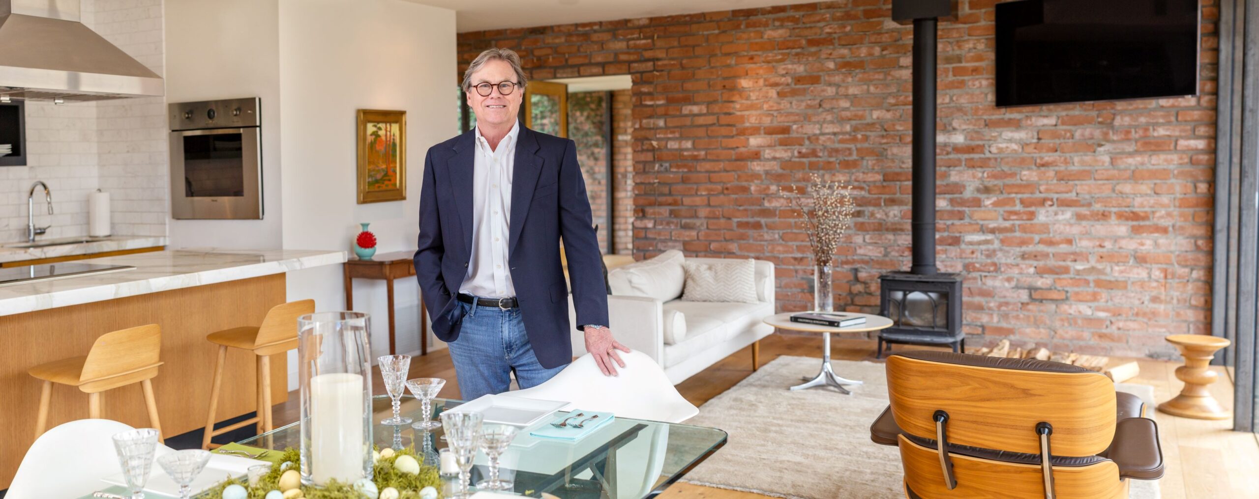
Clean lines, open spaces and a central volume marked by floor-to-ceiling glass walls pay homage to the iconic creations by midcentury masters.
“I call it a modern interpretation of midcentury,” Miller notes.
While adobe still plays a pivotal role in his design work, Miller’s own home features handmade reclaimed bricks that date to the late 1800s–early 1900s. When the architect purchased the property, only a couple of the brick walls and the original foundation remained.
“There was no roof, no interior walls,” Miller recalls.
Miller kept the brick, connecting the walls with large glass panes that seem to disappear into the ceiling and ground, creating a larger open sensation that flows seamlessly to the outdoors.
“It’s a tool that architects use to make a modest-size home live bigger,” Miller explains.
At just over 2,100 square feet, the architect’s home is small compared with the ones he designs for his clients.
A sizable wash flows past the home, while uninterrupted vistas of the Black Mountains frame the horizon. Native trees and flora combine with meticulously landscaped vignettes of golden barrels, yuccas, lady’s slippers and succulents soften the rocky slopes. The faux turf lawn is the perfect spot to kick back and watch the sunset.


“I’m not building a house in a vacuum,” Miller says. “I don’t just think about architecture. I think about the interior design and the landscape. In fact, landscaping surpasses architecture. If you have a great house that’s a 10, but the landscaping is a 1, you’ve just brought that whole project to a 5. On the other hand, you could have architecture that’s only risen to a 5, and you put in cool landscaping, you just brought the appreciation of that project closer to a 10.”
Lush native greenery flanks the front walkway, creating an organic and warm welcome.
“This is the most copied living room and house that I’ve designed,” Miller says. “After I built it, I got so many calls from people who said, ‘I want your house. I just want it bigger.’ So many of the homes that I’m doing now are taking the concept and stretching it. I’m even able to get them involved with period furnishings from the ‘50s — Herman Miller, Eames. That was really the philosophy of the leading architects of the Palm Springs movement.”
When Peter Kindrachuk decided to do a gut renovation on a historic 1964 adobe home in Carefree, Miller’s ability to create contemporary designs that preserve traditional details was the perfect fit. The project encompassed a remodel of the main residence as well as the addition of a 900-square-foot casita and a six-car garage.
“We looked at several architects, and we chose Clint because he has a love for this kind of home,” Kindrachuk says. “It would have been cheaper to demo the house and start over, but we wanted to preserve it.”
The 2,800-square-foot midcentury ranch had been remodeled over the years, with rounded corners and Pueblo revival styling. It is built from Sasabe adobe bricks from Mexico, which are less stable than the more highly fired adobe.
“Clint not only had experience working with [the material], but he also was excited about it,” Kindrachuk explains. “He was knowledgeable and willing to help us retain it. He was very helpful in getting it back to its traditional roots.”
Gone are the dated late 20th-century details. They’ve been replaced by a tongue-and-groove ceiling, exposed beams, new large steel-framed windows and custom steel doors. The original flagstone floors were expanded to the outdoor pool deck and porches. And the original adobe remains the star.
“In one sense, it’s traditional, but on the other, it’s modern, and that’s a combination that’s hard to get sometimes,” Kindrachuk says. “It’s a very tasteful design.”
Sue Vottero and her husband, Bob, currently are working with Miller on the construction of a custom modern adobe home, also in Carefree.
“Adobe was always our goal,” Sue says. “But we did not have any ideas of what it is turning out to be. We certainly never envisioned walls of glass.”
Like Kindrachuk’s and Miller’s own abode, the Votteros’ house is a blend of traditional and contemporary. Adobe brick volumes bookend a large glass central space.
“Some of the adobe homes feel very heavy inside, because they use so much of the material, whereas the glass lightens it up,” Sue notes. “Because all of our walls on the interior are going to show adobe, it’s going to be a nice mix.”
For Miller, the ability to combine his two interests — adobe and modernism — brings a new enthusiasm to his career.
“I love the combination of using an older material, like adobe, and bringing it into something modern,” Miller says. “I’ve had a blast doing this for all these years, and I hope to do it for another 10 years.”

