A Home For Life
Writer Amanda Christmann | Photography by Bryan Black
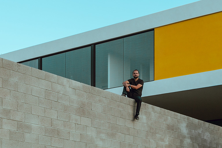
[dropcap]A[/dropcap] little less than midway up the western face of Black Mountain is something a little unusual, not just because of the contrast that its bright white and brilliant yellow cantilevered form creates with the surrounding slate and shale. The most remarkable aspect of this unique residence is not the building, but the residents themselves.
Nick and Ada Rose Mancusi may march to a different beat, but it’s a wonderful rhythm they follow.
Both masters’ degreed-graduates of Taliesin, the Frank Lloyd Wright School of Architecture, they’ve set out to live in a way that is kinder and more compassionate to the desert environment that they love.
They’ve also remained true to their laurels and refused to compromise form and function for the sake of style or trends. They’ve done it with a sense of fun and wittiness that not only makes them approachable; it makes people want to listen to and emulate what they’re doing.
Casa Mancusi, completed in late 2019, is their American Institute of Architecture Arizona merit award-winning home. It was designed and built primarily by Nick, but with significant help and input from Nick’s father, Ada Rose, various friends, and another colorful Cave Creek resident, Nick’s architectural mentor, Michael P. Johnson.
Straightforward with clean lines and breathtaking views, the two-bedroom, two-bath dwelling serves as both an architectural and graphic design office and a home, emphasizing all that is important without paltriness.
The color scheme is based primarily in white but is far from stark. A sunny yellow panel on the exterior and a bold fuchsia patio wall reflect the couple’s often whimsical personalities. Both vivid colors were inspired during a vacation to Mexico, and Nick and Ada Rose argued over which to use until they found a way to incorporate both.
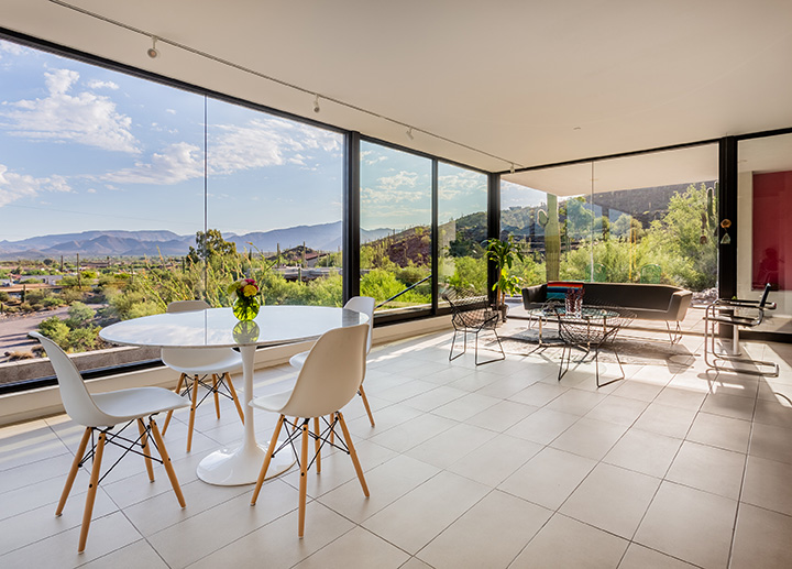
“My favorite parts of the house are the little things,” Nick says. “The view is awesome. I like how we used the glass in a way that really blurs the line between the inside and the outside. The views of the mountains and the town constantly give us the sense of being in Cave Creek. The house doesn’t let you forget that.”
Every space and feature was created with intention, from the way cabinetry was hung to tiny details in the flooring. Even the size of rooms and segments of the house were designed to maximize the budget by minimizing the number of lumber cuts and construction waste.


Building Upon a Different Model
More than a house, Casa Mancusi is part of an ongoing conversation to change the way architecture is approached — and it is a very personal one.
“I hate tract housing,” Nick says. “I think every architect hates tract housing. What I dislike the most is the idea of trends — this notion that, because some famous architect did something, that I need to try that same gimmick or trick, too — or because my neighbor did something, I need to do it.
“Trends are not what make homes and communities better. They’re really just about the flash and the show.”
Casa Mancusi is the exact opposite.
“For me, because it was a home for myself and Ada Rose, it gave me an opportunity to experiment on my own,” Nick adds. “I have always been fascinated with how architecture can be conceived in a way that’s competitive from a cost standpoint. I wanted to create a modest home on a modest and reasonable budget.
“Being a young person, and this being my first home, I didn’t have millions of dollars to spend. I really had to be methodical about how to use the resources I had so I could afford the materials and make something beautiful, but I also wanted to show an example of how to build in the desert.
“I had to ask myself, ‘How do you disturb the desert as little as possible?’ The answer was what it always should be in architecture — to let the site tell you what the building needs to be.”
Nick is among the latest of a growing line of architects, including Mies van der Rohe, Luis Barragan, Paolo Solieri, Frank Lloyd Wright and Michael P. Johnson, who is questioning the status quo and coming up with different and exciting answers.
“My goal is to create spaces that respond to how people live their lives,” Nick says.
His is a theory that veers sharply from decades of trends that force people’s lives to fit into dysfunctional design trends.
“Most buildings that are built today are medieval buildings,” he adds. “The people who originally came over [to the New World] were farmers, not architects or home builders. They built what they knew how to build, not necessarily what was the most functional or what made the most sense.
“We continue to build the same way today because it’s what we know. It’s a very narrow view.”
The idea of permanence seems to have been lost in many of the homes built today, replaced by temporary fads, Nick explains.
“We need to start to think about a building as designing with pertinence,” he adds. “One reason I like old buildings is that, when they were built, people weren’t talking about trends and what was ‘fashionable.’ It was all about making it functional. I resonate with that. Old buildings are honest and true. Anyone can put lipstick on a pig, but at the end of a day, a good building doesn’t need anything to look good.”
To the architectural amateur, his approach would be described as “style.” Not so, argues Nick.
“There is absolutely no such thing as style in architecture,” he says. “It’s just a gimmick. I hate that.
“It’s not like the flashy minimalism you see in magazines. Real architecture is when things are done in a way that is really smart, sensitive and balanced, and it’s spending time on the quality of the space. Once you break away from convention, you allow the system you’re working in to narrate what is needed, and what the structure will look like.”
Nick has followed his own philosophy in executing every detail — including in the foundation — of Casa Mancusi. The home’s patio and living room rest upon the grade of the mountain, while the rest of the house seems to float above the desert.
“I had to figure out how to work with the natural grades of the mountain,” Nick says. “It was a challenge to balance the cut and fill with the practicality of what we needed. I think we did a pretty good job of that. The only real cutting we had to do was to create the driveway and septic system.
“First, I had to figure out how to put everything on one level and how to save money. The answer was to build a structure that cantilevers out. To do that, a beam became necessary. When you come upon the house from the southeast, you just see a white box hanging off of what looks like a really thin post, like a stiletto heel.
“All of a sudden, you have all of these elements that satisfy needs, and the exterior of the building begins to look the way it does as you achieve those aesthetic elements. The building looks the way it does because I didn’t build it around a particular style.”


An Orchestrator of Elements
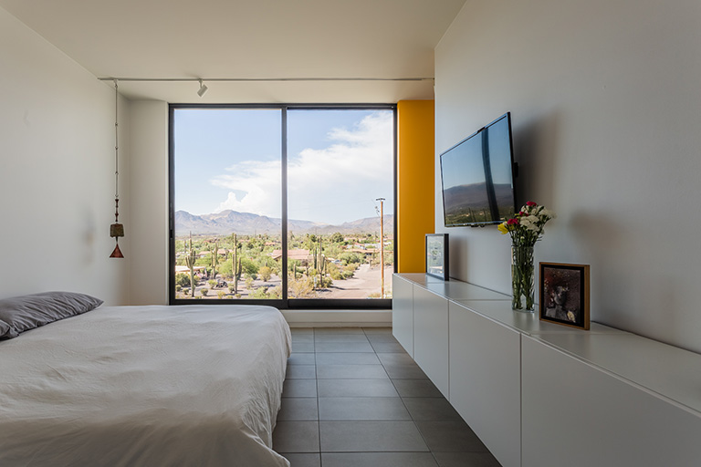
The brilliance of Casa Mancusi is in its simplicity. Save for maple shelving and a few other touches, concrete, steel and glass are the primary building materials. Floors are covered in rectangular gray tile, and the bright white interior and exterior accentuate clean, straight lines.
Living spaces are uncluttered and void of knickknacks but offer plenty of storage and comfort. Small touches like built-in cubbies on Ada Rose’s side of the bed where she can keep her favorite things, and bookshelves for Nick so that he can indulge in his favorite pastime take the building beyond the status of a house and turn it into a home.
The kitchen is separated from other living spaces upon Ada Rose’s request. She enjoys the separation it allows to get creative with pies and biscuits.
There are no doors to be found inside the house. Each module flows logically and cleanly into the next. Still, there are plenty of privacy and spaces to relax thanks to walk-around walls and other creative solutions.
“It’s really dialed around having space for two people to live,” explains Nick, who, along with his dad, who is a contractor, and a few friends, did the majority of the construction.
Casa Mancusi encompasses the couple’s approach to architecture. Form and function are one and the same. Its foundation in common sense is a refreshing departure from the fussiness and impracticality found the last two decades or so in Valley construction.
“I read a quote recently that said something like, ‘An artist is constantly simplifying, and an amateur is constantly trying to make things more complex,’” Nick says. “The process of designing this home really drove that home for me.
“Architecture is this really unique balance between art, the majesty of spatial planning and how people live and think and breathe, and then you add proportion and scale. At the other end of it is that a home must have quality and function.
“If you weigh one element against the other and don’t balance all the elements, it ends up terribly. If you balance those elements, then you hit a sweet spot.”

